Research & Problem Statement
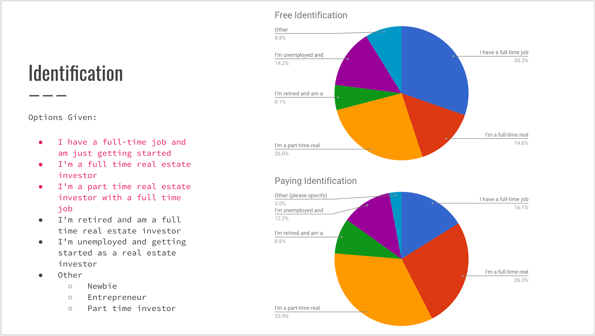
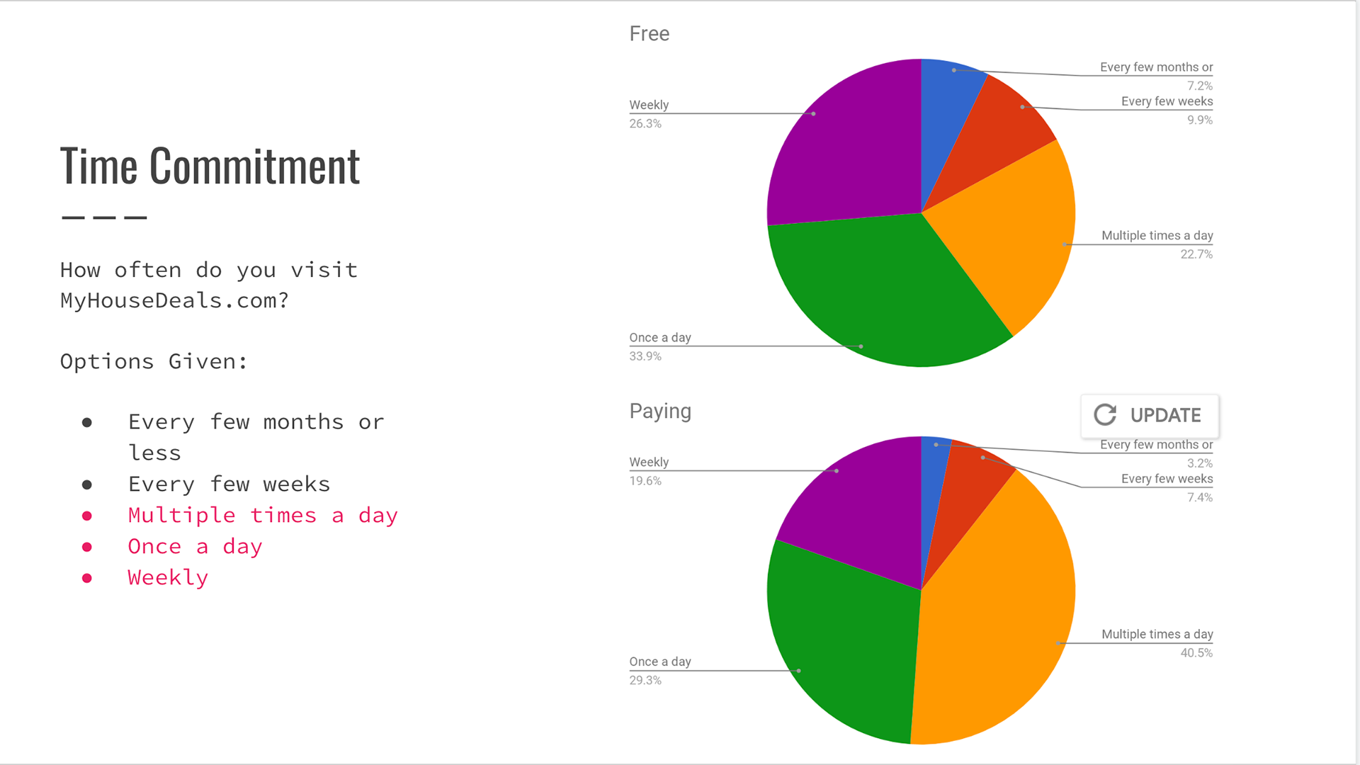
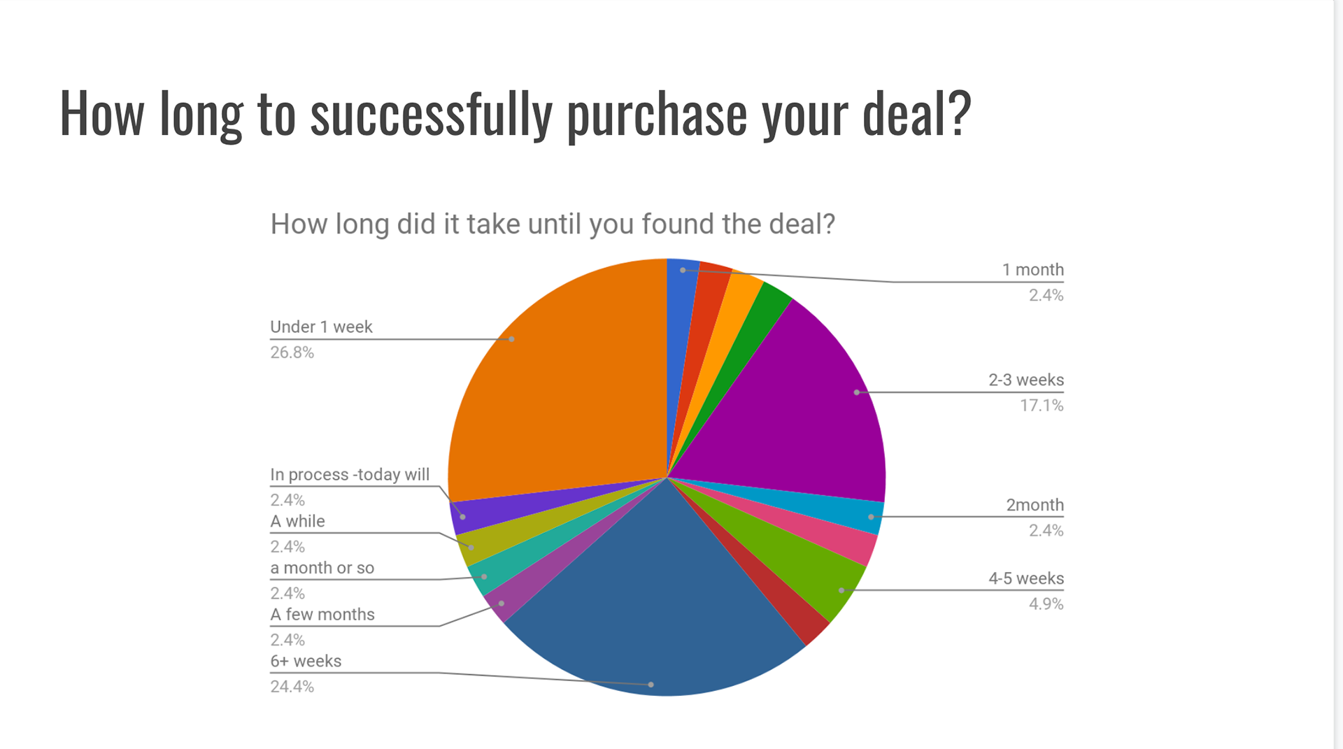
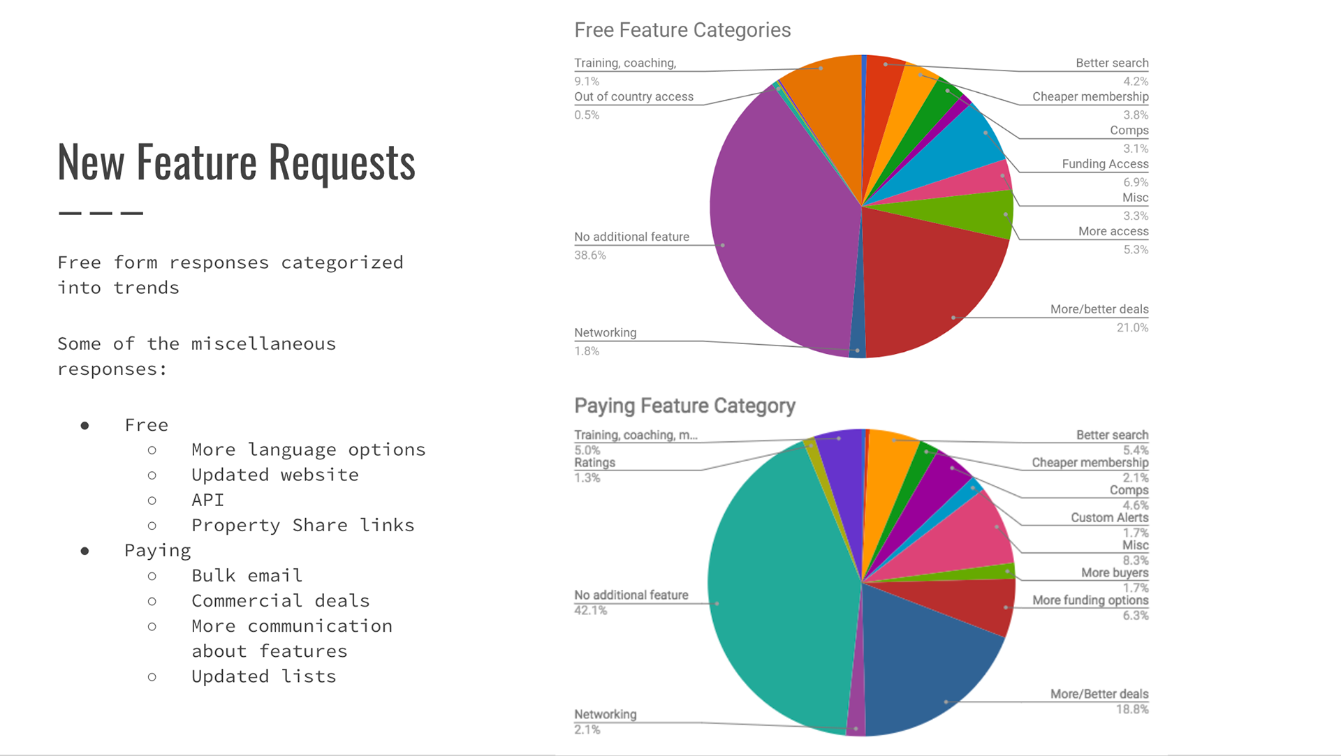
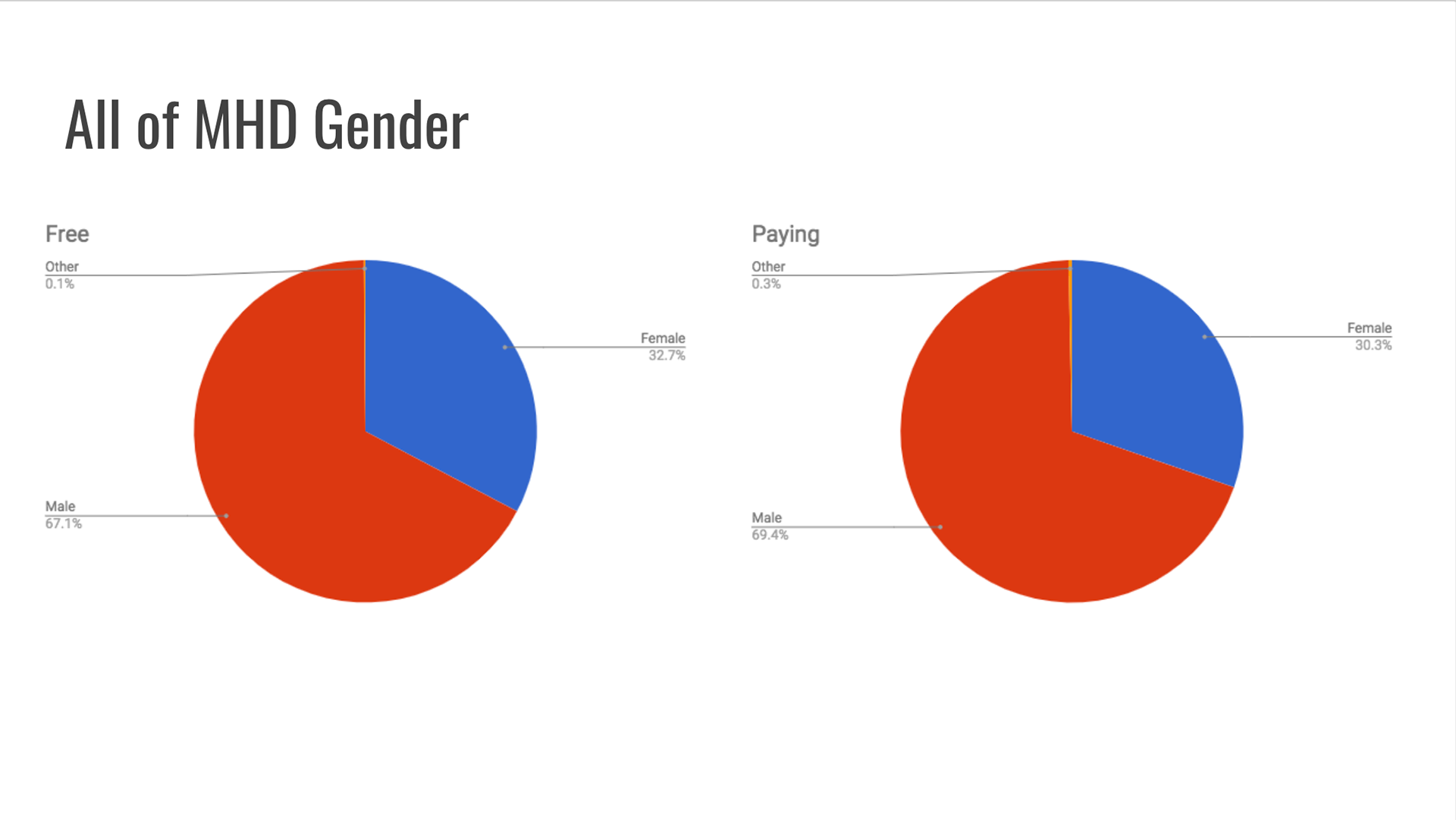
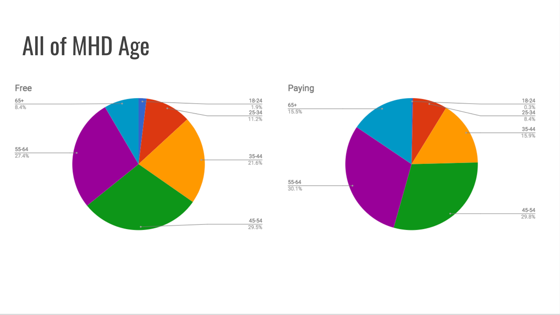
As a company, we used an annual survey to ask MyHouseDeals members how we were doing in serving them, what features were lacking, what they liked and disliked, etc.
After analyzing the data we found that our members struggled finding important pieces of information on the properties they were interested in purchasing, so we embarked on user interviews to learn more about what was important to them.
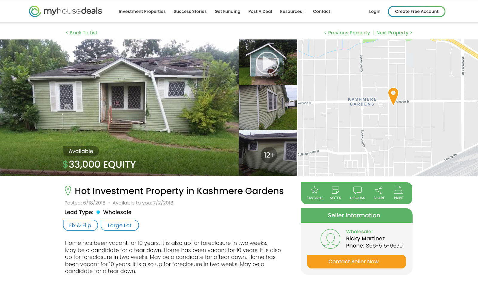
We continued to analyze data and identified trends in the information that was most important to our users and embarked on an effort to redesign the property details pages on MyHouseDeals so that the information most important to our members was more easily identifiable and accessible.
User Flow
Member searches for property >>> Member sees property details >>> Member is allowed certain pieces of property information based on their membership type >>> Member has all important property information easily accessible above the fold of the page
Ideate & Sketch
Designs & Views


Testing
It was important that we tested the following for this page redesign:
1. Time spent on the redesigned page compared to the original
2. Number of clicks on the redesigned page compared to the original
3. Abandonment rate on the redesigned page compared to the original
4. Membership conversion rate on the redesigned page compared to the original
We were able to accomplish this by establishing an A/B test on our website where 50% of our audience saw the original design and 50% of our audience saw the redesigned page.
After our efforts, we were delighted to see that our membership conversion rates increased by 30%, and the time spend on the page and number of clicks on the page almost doubled, which also resulted in a reduction in our abandonment rate.
